Alien Apparel - Fantasy Initiative

Started by Cosmic Incubation, May 24, 2024, 05:26:47 PM

Author
Alien Apparel - Fantasy Initiative (Read 553 times)

Cosmic Incubation

Cosmic Incubation

A nice spread of some Alien themed shirts, a hoodie, and a hat from Fantasy Initiative/Slaughter Bootlegs

Their post says that these will be available to order until 12pm EST on Monday 5/27.

https://slaughterbootlegs.com/


bobby brown

Awful.

Cosmic Incubation


bobby brown

Alright, I'll be more constructive.

The vibe of the stuff you posted, reads to me as Gen Z aesthetics crossed with a 45-year-old film. It benefits neither. When working with such an IP as ALIEN, one should lean into its (very rich) iconography. Not cross-pollinate it with contemporary (and, to me, lame) design language.

I don't know if you are the designer, for which I apologize for my first blunt response. I can appreciate most creative ambitions. Keep at it.

But it needs to be more inventive. Just a monochromatic screenshot with text plastered on top just doesn't look appealing. It looks busy. Also, to rip that title from the graphic novel and plaster an additional title right on top is just not respectful to the original artist. If you are going to steal, At least do it justice.

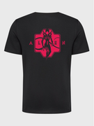
Here is an example of the polar opposite side of the spectrum.
Spectacular original artwork that fully utilizes the iconography of the IP. Yet, way overdesigned.
If you were wearing these, it would look like the shirt was wearing you.


Here are my own takes. Feel free to return any criticism.
I try to stay on brand without overdoing it; I create my own assets, And I try to lean into the era from which the subject stems from, like with the 70s ringer tees and stuff.


SiL

SiL

#4
I second that these designs seem to be an unimpressive collage of work slapped together with little thought to the underlying design.

What they did to the title of the original comic is garish and deeply unappealing. Such an intricate, considered design with such blunt green text slapped over feels both insulting and cheap.

Cosmic Incubation

@bobby brown I appreciate your more constructive and in-depth thoughts. To clarify: I'm not the designer of these (though I am a graphic designer by trade). Also, I shared them because I like them, but I wouldn't get upset at someone for simply not liking these. It was just the blunt and negative comment being the only response to my post that kinda agitated me tbh. But again, no hard feelings since you responded in kind with more in-depth comments.

I personally like these designs. I respectfully disagree that designs/apparel for an IP should be constricted to the time that they originate from, and I enjoy the overall use of more modern design styles.
I think they have somewhat a simplistic, DIY collage aesthetic that I tend to like.

But it seems to just be a difference in aesthetic preferences, which is fair enough. I appreciate the discussion. 

AvPGalaxy: About | Contact | Cookie Policy | Manage Cookie Settings | Privacy Policy | Legal Info
Facebook Twitter Instagram YouTube Patreon RSS Feed
Contact: General Queries | Submit News