Latest News

Post Comment
Comments: 51
« Newer Comments 12 Older Comments »
  1. ryanjayhawk
    Quote from: Darth Vile on May 12, 2012, 08:24:42 AM
    Quote from: ryanjayhawk on May 12, 2012, 01:15:43 AM
    Quote from: Darth Vile on May 11, 2012, 11:15:15 PM
    Quote from: ryanjayhawk on May 11, 2012, 02:24:35 PM
    Quote from: Darth Vile on May 11, 2012, 02:15:44 PM
    Quote from: ryanjayhawk on May 11, 2012, 01:01:46 PM
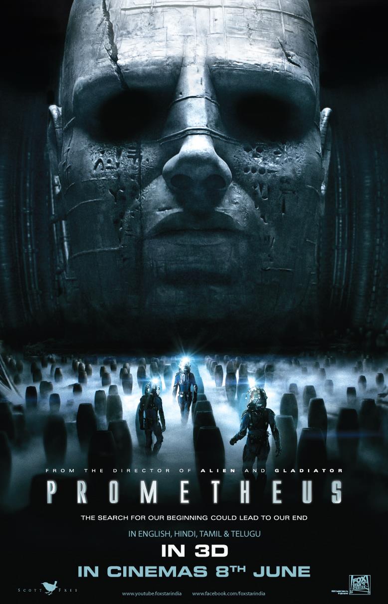
    No over-reaction... the head is not 100 ft. tall... so why would it be in the poster?
    I never remember the egg floating in space with green mist in the first movie... it'called artistic licence.

    It's called stupid...  It gives people the idea the head has scale that it doesn't...

    Same could be levelled at the original Jaws poster... or the original Star Wars ones (that bear little resemblance to what actually goes on in the movie). Accentuating the shape/size of the thing to look more imposing than it actually is, may be the idea. You don't have to like it, but it doesn't make it bad.

    I would argue that the original Jaws poster was much closer in scale, and its a painting so it gets a pass from me there...  The Star Wars poster was a painting and was the characters large over a background.  The Prometheus Poster is not a painting, and the designer just increased the scale of the head in the same scene making it much larger than it actually is...
    Not really - if you look at the radius of the mouth of the shark in the poster, it makes it about circa 50 ft. Compare it to the production still of Spielberg lying in the mouth of the Shark. As for The Star Wars posters - yes indeed things were over scaled. Vader's head is usually a giant head in the background and Han & Leia in the 'Empire' poster dwarf everything else, in a pose that was never in the movie.

    Those posters being 'painted' is largely irrelevant as one either excepts the creator can use artistic licence or not. The poster for Prometheus isn't an onset production still, it's a stylised rendition of a scene/moment (we expect), and as such the artist in question is scaling up the size of the head for dramatic effect. I don't think anyone will come out of the movie thinking "well I feel cheated by the size of the head". ;-)

    It't ok to agree to disagree... I know the head has been the watershed scene from whats been shown... but I simply think this poster is lazy and misrepresenting.  Your Jaws example makes sense, Jaws 2 would probably be better... I think it seems lazy.
  2. Darth Vile
    Quote from: ryanjayhawk on May 12, 2012, 01:15:43 AM
    Quote from: Darth Vile on May 11, 2012, 11:15:15 PM
    Quote from: ryanjayhawk on May 11, 2012, 02:24:35 PM
    Quote from: Darth Vile on May 11, 2012, 02:15:44 PM
    Quote from: ryanjayhawk on May 11, 2012, 01:01:46 PM
    No over-reaction... the head is not 100 ft. tall... so why would it be in the poster?
    I never remember the egg floating in space with green mist in the first movie... it'called artistic licence.

    It's called stupid...  It gives people the idea the head has scale that it doesn't...

    Same could be levelled at the original Jaws poster... or the original Star Wars ones (that bear little resemblance to what actually goes on in the movie). Accentuating the shape/size of the thing to look more imposing than it actually is, may be the idea. You don't have to like it, but it doesn't make it bad.

    I would argue that the original Jaws poster was much closer in scale, and its a painting so it gets a pass from me there...  The Star Wars poster was a painting and was the characters large over a background.  The Prometheus Poster is not a painting, and the designer just increased the scale of the head in the same scene making it much larger than it actually is...
    Not really - if you look at the radius of the mouth of the shark in the poster, it makes it about circa 50 ft. Compare it to the production still of Spielberg lying in the mouth of the Shark. As for The Star Wars posters - yes indeed things were over scaled. Vader's head is usually a giant head in the background and Han & Leia in the 'Empire' poster dwarf everything else, in a pose that was never in the movie.

    Those posters being 'painted' is largely irrelevant as one either excepts the creator can use artistic licence or not. The poster for Prometheus isn't an onset production still, it's a stylised rendition of a scene/moment (we expect), and as such the artist in question is scaling up the size of the head for dramatic effect. I don't think anyone will come out of the movie thinking "well I feel cheated by the size of the head". ;-)
  3. ryanjayhawk
    Quote from: Darth Vile on May 11, 2012, 11:15:15 PM
    Quote from: ryanjayhawk on May 11, 2012, 02:24:35 PM
    Quote from: Darth Vile on May 11, 2012, 02:15:44 PM
    Quote from: ryanjayhawk on May 11, 2012, 01:01:46 PM
    No over-reaction... the head is not 100 ft. tall... so why would it be in the poster?
    I never remember the egg floating in space with green mist in the first movie... it'called artistic licence.

    It's called stupid...  It gives people the idea the head has scale that it doesn't...

    Same could be levelled at the original Jaws poster... or the original Star Wars ones (that bear little resemblance to what actually goes on in the movie). Accentuating the shape/size of the thing to look more imposing than it actually is, may be the idea. You don't have to like it, but it doesn't make it bad.

    I would argue that the original Jaws poster was much closer in scale, and its a painting so it gets a pass from me there...  The Star Wars poster was a painting and was the characters large over a background.  The Prometheus Poster is not a painting, and the designer just increased the scale of the head in the same scene making it much larger than it actually is...
  4. Virgil
    Quote from: Master on May 11, 2012, 09:59:02 PM
    Quote from: Virgil_uk on May 11, 2012, 08:02:17 PM
    Quote from: SpreadEagleBeagle on May 11, 2012, 07:38:59 PM
    What a lame poster... Meh...

    How about this bad boy?

    https://www.avpgalaxy.net/forum/proxy.php?request=http%3A%2F%2F4.bp.blogspot.com%2F-63KqiJ8OJKo%2FTq3QFWBCBpI%2FAAAAAAAAChQ%2FwMmPHIDv1iQ%2Fs1600%2Falien-polish-movie-poster1.jpg&hash=a4499511c3e3ff5c566d23145730eb255d8e01ab

    It`s fine example of old Polish school of posters. All of posters in that era were strange and abstract but they were also art. Nowadays all posters are done in photoshop...

    I wasn't complaining  :) and I agree with you that there's a severe lack of this type of poster today.
  5. Darth Vile
    Quote from: ryanjayhawk on May 11, 2012, 02:24:35 PM
    Quote from: Darth Vile on May 11, 2012, 02:15:44 PM
    Quote from: ryanjayhawk on May 11, 2012, 01:01:46 PM
    No over-reaction... the head is not 100 ft. tall... so why would it be in the poster?
    I never remember the egg floating in space with green mist in the first movie... it'called artistic licence.

    It's called stupid...  It gives people the idea the head has scale that it doesn't...

    Same could be levelled at the original Jaws poster... or the original Star Wars ones (that bear little resemblance to what actually goes on in the movie). Accentuating the shape/size of the thing to look more imposing than it actually is, may be the idea. You don't have to like it, but it doesn't make it bad.
  6. SM
    Quote from: ryanjayhawk on May 11, 2012, 02:24:35 PM
    Quote from: Darth Vile on May 11, 2012, 02:15:44 PM
    Quote from: ryanjayhawk on May 11, 2012, 01:01:46 PM
    No over-reaction... the head is not 100 ft. tall... so why would it be in the poster?
    I never remember the egg floating in space with green mist in the first movie... it'called artistic licence.

    It's called stupid...  It gives people the idea the head has scale that it doesn't... FWIW I am not fond of the original cover either, the egg doesn't look the same, the light implies opening at the bottom, and I don't remember the net...

    Don't worry, giant French Noomi head will protect you!

    And we'll call in wrong scale Kong and Fay Wray just in case too.
    https://www.avpgalaxy.net/forum/proxy.php?request=http%3A%2F%2Ft3.gstatic.com%2Fimages%3Fq%3Dtbn%3AANd9GcRCDSMWOZr8k6jl1HLFHt70yJcmOJEDhDhKs2nv8VFyjfJPWdBKUA&hash=8649cba0f66cbafec65d27bda4b61276c4632d5b
  7. Master
    Quote from: Virgil_uk on May 11, 2012, 08:02:17 PM
    Quote from: SpreadEagleBeagle on May 11, 2012, 07:38:59 PM
    What a lame poster... Meh...

    How about this bad boy?

    https://www.avpgalaxy.net/forum/proxy.php?request=http%3A%2F%2F4.bp.blogspot.com%2F-63KqiJ8OJKo%2FTq3QFWBCBpI%2FAAAAAAAAChQ%2FwMmPHIDv1iQ%2Fs1600%2Falien-polish-movie-poster1.jpg&hash=a4499511c3e3ff5c566d23145730eb255d8e01ab

    It`s fine example of old Polish school of posters. All of posters in that era were strange and abstract but they were also art. Nowadays all posters are done in photoshop...
  8. ryanjayhawk
    When I first saw the Alien VHS box at my local grocery store video section... (yes they used to exist) the image disturbed me, but once I had seen the movie and looked at it more, it didn't translate to anything I had seen and it didn't make sense, not even in a cool abstract way.

    I think the head could have had more presence if it had been done to larger scale, but since it wasn't it bothers me that these posters give it all this scale... it looks 50 ft. tall in the poster...
  9. Virgil
    Quote from: ryanjayhawk on May 11, 2012, 02:24:35 PM
    Quote from: Darth Vile on May 11, 2012, 02:15:44 PM
    Quote from: ryanjayhawk on May 11, 2012, 01:01:46 PM
    No over-reaction... the head is not 100 ft. tall... so why would it be in the poster?
    I never remember the egg floating in space with green mist in the first movie... it'called artistic licence.

    It's called stupid...  It gives people the idea the head has scale that it doesn't... FWIW I am not fond of the original cover either, the egg doesn't look the same, the light implies opening at the bottom, and I don't remember the net...

    Oh, come on now  ;D You're surely arguing for the sake of it here.

    https://www.avpgalaxy.net/forum/proxy.php?request=http%3A%2F%2Fwww.impawards.com%2F1979%2Fposters%2Falien.jpg&hash=05899da3d96758cb8be7e3c94291da5f5e145685

    It's a f@cking classic!

    I'm also going to go against the grain here and confess that I love the image Imax are using for their international poster. Not half as much as the first poster mind, but the urns carry this beautiful, ominous presence. Very 'Ridley' with all that smoke  ;)
  10. ryanjayhawk
    Quote from: Darth Vile on May 11, 2012, 02:15:44 PM
    Quote from: ryanjayhawk on May 11, 2012, 01:01:46 PM
    No over-reaction... the head is not 100 ft. tall... so why would it be in the poster?
    I never remember the egg floating in space with green mist in the first movie... it'called artistic licence.

    It's called stupid...  It gives people the idea the head has scale that it doesn't... FWIW I am not fond of the original cover either, the egg doesn't look the same, the light implies opening at the bottom, and I don't remember the net...
  11. ADC
    I think the Indian poster is terrible. It's not a bad idea – I can go with that – but the execution is very poor.

    Didn't we see a very similar image with the original Entertainment Weekly story? At that time I thought it was something that the magazine's designers had photoshopped which would account for its poor quality; the perspective is out and the proportions between the figures and urns are clearly wrong.

    That said, foreign move posters are often left to the discretion of the marketing teams in those territories and may well appeal to people in those countries – remember the famous Alien posters from Poland?
    http://www.polishposter.com/Merchant2/merchant.mvc?Screen=PROD&Product_Code=0212

    The Indian Prometheus poster evokes Hindu idols and imagery so I can see why they might have gone with that.

    Unlike the 70s or 80s, anyone can do a lash-up in Photoshop and I think that's one of the reasons you see so much dodgy artwork these days. Personally, my fave poster so far is still the teaser. And that, let's face it, is nowhere near as mysterious, memorable or engaging as the poster for Alien. Hard act to follow...

    I'd like to see a new poster for Prometheus. Avatar had a minimalist teaser and then a few variants for the movie's release. I'd like to see the same treatment for Prometheus.
  12. Vickers
    That poster is terrible!  I like how the original poster was mysterious and had the right amount of dark and the right amount of the head illuminated by Shaw's torch.  It looks beautiful.

    Hell, I've seen far better fan posters than the international poster.
  13. ryanjayhawk
    Stupid Poster is Stupid...

    The scale on the head has been altered to make it appear much larger than it actually is... which I hate.  If the head was supposed to be that large and menacing than it should have been that large... when all the other shots shows a much smaller room and much smaller head, it makes this poster pointless.
« Newer Comments 12 Older Comments »
AvPGalaxy: About | Contact | Cookie Policy | Manage Cookie Settings | Privacy Policy | Legal Info
Facebook Twitter Instagram YouTube Patreon RSS Feed
Contact: General Queries | Submit News