Latest News

Post Comment
Comments: 50
  1. RoaryUK
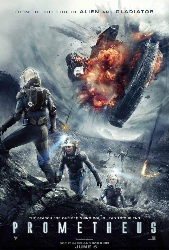
    Nice picture but photo-shopped and way too obviously, at least 20 elements in there anyone who knows anything about this film would pick out straight away, plus Vickers and Shaw feature twice in the same scene.... someone's a big fan then... lol
  2. Promethean Fire
    If I recall correctly, the early synopsis released from Fox mentioned something about "a crew stranded on a planet" which would imply that this is the thrust of the film.  Then again, Charlize mentions she did alot of running in Iceland for the third act.  The tracklisting for the score also confirms this but, again, this could all just be clever misdirection.
  3. Kess
    I think you might be right.  If the Prometheus/Juggernaut collision was at the climax of the film then surely they would not have revealed it so clearly in the trailers.
  4. Ballzanya
    I'm beginning to think the collision with the jockey ship and the ship which detaches from the main prometheus ship in space to land on the planet (presumably, although it could be the whole ship that lands there) happens a little earlier in the film than everything thinks. There may indeed be a second jockey ship. Or else this poster just wants to make you think that and is not accurate at all. lol
  5. Nightmare Asylum
    Can't say I'm a huge fan other the poster. Its not bad, just a bit too in your face for my taste. Some movies work well with posters like that, but it just doesn't fit with Prometheus, given what we've seen so far.
  6. Ash 937
    A poster by Drew Struzan that is similar to the work he did for the original Star Wars trilogy, Back to the Future, and Blade Runner would be awesome.  I've always been a fan of his posters that look more like paintings rather than stills that were just pulled out of movies and slapped on a 27x40 print.

    But I still think this poster is pretty cool.
  7. Gash
    Not really that keen. If they're going to do a more illustrative poster they need to get Drew Struzan and stop faffing about with these cut-price photoshop composites.
  8. Cvalda
    Quote from: Vickers on May 17, 2012, 08:24:20 AM
    I like the image, but I hate the Photoshop work.  To be honest, I think this same image would have looked better painted.  I like the old school painted posters that were beautiful works of art.
    Pretty much my thoughts as well. Although I do like the poster overall, fanmade or otherwise. I'd hang it on my wall, sure--really like the pulp sci-fi look, as others have remarked.
  9. Ruadh
    There's not really anything wrong with photoshop. You kinda have to these days. 30 years ago, a lot of posters and such were airbrushed. Doesn't make it any less fantastic.
  10. Bat Chain Puller
    Looks like a fan made poster to me. Every 'element' in the picture has been made available for weeks (even months) now. Vickers there is the shot of her in the cargo hold entrance holing the flamethrower for example.

    HDR to the max in photoshop. Since they made it easy in CS5, it's been heavily over used.
  11. StrangeShape
    Quote from: fiveways on May 17, 2012, 03:02:03 PM
    If I knew nothing about the movie that poster alone would get me into the theatre.  It is everything I like about sci-fi.  It has, as stated a feeling of older Pulp stuff, and also Heavy Metal and all the old warren horror publications of the '70's.  At the same time it looks like the movies I grew up watching VHS boxes[the only thing it is missing is little boxes at the bottom naming the actors with there heads in the boxes].  Just amazing.

    At the same time it reminds me of some of the International posters for films like solaris and alien from the 70's.  Kinda wrong and out of place but f**king awesome at the same time.

    It's just so f**king pulp it makes me super happy.  f**k modern posters.  That belongs on my wall next to my Battle Beyond the Stars and my Star Crash posters.

    My thoughts exactly. This poster screams classic scifi, and knowing whos behind the camera only elevates it to the Nth degree. The closer it gets to the premiere and the more stuff we see, the more excited and confident I am in this movie
  12. fiveways
    If I knew nothing about the movie that poster alone would get me into the theatre.  It is everything I like about sci-fi.  It has, as stated a feeling of older Pulp stuff, and also Heavy Metal and all the old warren horror publications of the '70's.  At the same time it looks like the movies I grew up watching VHS boxes[the only thing it is missing is little boxes at the bottom naming the actors with there heads in the boxes].  Just amazing.

    At the same time it reminds me of some of the International posters for films like solaris and alien from the 70's.  Kinda wrong and out of place but f**king awesome at the same time.

    It's just so f**king pulp it makes me super happy.  f**k modern posters.  That belongs on my wall next to my Battle Beyond the Stars and my Star Crash posters.
  13. Valaquen
    I don't understand why they would give away the Prometheus crashing into the Juggernaut, in either the trailers or the poster. There had better be something up the movie's sleeve other than this, because if it's the finale ... way to give the game away.
  14. DendaReloaded
    so, they just took the prometheus ship from the landing sequence (as it crahes with the cockpit in the front)
    and the old juggernaut collision (the new one looks different, they've made a new texture and redesigned the whole collision process.

    the poster needs defiantely more bayplosion
  15. Space Sweeper
    Quote from: SpeedyMaxx on May 17, 2012, 08:03:28 AM
    Conjures up exactly the Forbidden Planet/Planet of the Vampires, quasi-Lovecraftian exploration pulp scifi with heady concepts vibe this film trades on.
    I was about to say the exact same thing. Really wish this was traditionally drawn though, then the image would be complete.

    [EDIT]
    Nevermind, seems like another great mind has already spoken for that, too :):
    Quote from: Vickers on May 17, 2012, 08:24:20 AM
    I like the image, but I hate the Photoshop work.  To be honest, I think this same image would have looked better painted.  I like the old school painted posters that were beautiful works of art.

    Exactly. All of this like-minded thinking makes me want to attempt a [non-traced] version of it...

    [EDIT #2...]

    Quote from: SpeedyMaxx on May 17, 2012, 08:43:29 AM
    It really does remind me of an old sci-fi pulp comic book cover or novel - you can easily transpose it, with a little less spaceship, onto something like a pulp adaptation of At The Mountains of Madness.  Intrepid explorers on vicious, alien terrain looking onwards towards unimaginable disaster.  I just dig the retro action snap, the kineticism and willingness to show action and terror.  In that sense, though it's a very modern poster in execution, it stirs up a feel of a bygone age - something of vitality and discovery long gone by Alien.

    Congradulations, you're now without a doubt my favorite Prometheus section-exclusive member.
  16. AsapJockey
    Well we know now there's only 3 people left alive , and there's two mutants on the ground while things blow up as well, I feel this major plot point is a misdirection for something we haven't seen....JOCKEY ALIENS!
  17. Salt The Fries
    Quote from: SpeedyMaxx on May 17, 2012, 08:43:29 AM
    It really does remind me of an old sci-fi pulp comic book cover or novel - you can easily transpose it, with a little less spaceship, onto something like a pulp adaptation of At The Mountains of Madness.  Intrepid explorers on vicious, alien terrain looking onwards towards unimaginable disaster.  I just dig the retro action snap, the kineticism and willingness to show action and terror.  In that sense, though it's a very modern poster in execution, it stirs up a feel of a bygone age - something of vitality and discovery long gone by Alien.

    I dig the Sorcerer comparison, Salt!  Though I do feel reasonably positive we'll have a better BO take.

    For sure, and I bet all IMAX and other premiere screenings will generate as much money from pre-sales alone as Sorcerer did in total in 1977 :D
  18. SpeedyMaxx
    It really does remind me of an old sci-fi pulp comic book cover or novel - you can easily transpose it, with a little less spaceship, onto something like a pulp adaptation of At The Mountains of Madness.  Intrepid explorers on vicious, alien terrain looking onwards towards unimaginable disaster.  I just dig the retro action snap, the kineticism and willingness to show action and terror.  In that sense, though it's a very modern poster in execution, it stirs up a feel of a bygone age - something of vitality and discovery long gone by Alien.

    I dig the Sorcerer comparison, Salt!  Though I do feel reasonably positive we'll have a better BO take.
  19. Darth Vile
    They seem to be intent on giving away, what we would believe to be, a major plot point re. "ramming speed". Other than that, I think it's an ok poster which is obviously more kinetic than the others...
  20. Vickers
    I like the image, but I hate the Photoshop work.  To be honest, I think this same image would have looked better painted.  I like the old school painted posters that were beautiful works of art.


    Oh, and it seems that they don't care that everyone will be expecting the Prometheus to crash into the Juggernaut and that Janek will die.  They've been alluding to it in almost every trailer and now in this poster.
  21. SpeedyMaxx
    Gorgeous.  Want it.

    Conjures up exactly the Forbidden Planet/Planet of the Vampires, quasi-Lovecraftian exploration pulp scifi with heady concepts vibe this film trades on.  It's not Alien.  It's something bigger and more idealized and grandiose that goes horribly wrong.
AvPGalaxy: About | Contact | Cookie Policy | Manage Cookie Settings | Privacy Policy | Legal Info
Facebook Twitter Instagram YouTube Patreon RSS Feed
Contact: General Queries | Submit News